WhatsApp /* Footer Styles */ .footer { background: linear-gradient(to bottom, #0F172A, #020617); color: var(--text-light); padding: 6rem 0 2rem; position: relative; z-index: 0; } .footer-container { max-width: 1200px; margin: 0 auto; padding: 0 2rem; } .footer-content { display: grid; grid-template-columns: 2fr 1fr 1fr 1.5fr; gap: 4rem; padding-bottom: 4rem; } .footer-brand h2 { font-size: 2rem; font-weight: 700; background: linear-gradient(135deg, var(--highlight-orange), var(--primary-blue)); -webkit-background-clip: text; -webkit-text-fill-color: transparent; margin-bottom: 1.5rem; } .footer-brand p { color: var(--text-light); line-height: 1.8; text-shadow: 0 1px 2px rgba(0, 0, 0, 0.3); } .footer-nav h3 { color: var(--text-light); font-size: 1.25rem; font-weight: 600; margin-bottom: 1.5rem; text-shadow: 0 1px 2px rgba(0, 0, 0, 0.3); } .footer-nav ul { list-style: none; padding: 0; } .footer-nav li { margin-bottom: 1rem; } .footer-nav a { color: var(--text-light); text-decoration: none; transition: all 0.3s ease; text-shadow: 0 1px 2px rgba(0, 0, 0, 0.3); } .footer-nav a:hover { color: var(--highlight-orange); transform: translateX(5px); } .footer-subscribe { background: var(--glass-dark-bg); padding: 2rem; border-radius: 16px; border: 1px solid rgba(255, 255, 255, 0.05); backdrop-filter: blur(10px); text-align: center; } .footer-subscribe h3 { color: var(--text-light); margin-bottom: 1rem; text-shadow: 0 1px 2px rgba(0, 0, 0, 0.3); } .footer-subscribe p { color: var(--text-light); text-shadow: 0 1px 2px rgba(0, 0, 0, 0.3); margin-bottom: 1.5rem; } .subscribe-form { display: flex; flex-direction: column; gap: 1rem; align-items: center; } .subscribe-form input { width: 100%; max-width: 300px; padding: 1rem; border-radius: 8px; border: 1px solid rgba(255, 255, 255, 0.1); background: rgba(255, 255, 255, 0.05); color: var(--text-light); outline: none; } .subscribe-form button { width: 100%; max-width: 300px; padding: 1rem 2rem; background: var(--primary-blue); color: var(--text-light); border: none; border-radius: 8px; cursor: pointer; transition: all 0.3s ease; white-space: nowrap; } .subscribe-form button:hover { background: var(--secondary-blue); transform: translateY(-2px); } .footer-bottom { padding: 2rem 0; border-top: 1px solid rgba(255, 255, 255, 0.1); text-align: center; } .footer-bottom p { color: var(--text-light); text-shadow: 0 1px 2px rgba(0, 0, 0, 0.3); } /* Responsive Styles */ @media (max-width: 991px) { .nav-menu { display: none; position: fixed; top: 60px; left: 0; right: 0; width: 100%; background: rgba(11, 17, 32, 0.95); flex-direction: column; justify-content: center; align-items: center; padding: 2rem 1rem; z-index: 1000; transition: all 0.3s ease; } .nav-menu.active { display: flex; } .nav-link { font-size: 1.2rem; padding: 1rem; } .mobile-menu-btn { display: flex; } .service-hero { padding-top: 6rem; } .service-content { padding-top: 4rem; } .service-content h1 { font-size: 2.5rem; } .benefits-grid { grid-template-columns: 1fr; } .process-grid { grid-template-columns: 1fr; } } @media (max-width: 768px) { .service-hero { min-height: 50vh; padding-top: 4rem; } .service-content h1 { font-size: 2rem; } .service-content p { font-size: 1.1rem; } .benefit-card { padding: 1.5rem; } .benefit-card h3 { font-size: 1.2rem; } .process-text h2 { font-size: 2rem; } .process-text p { font-size: 1rem; } .footer-content { grid-template-columns: 1fr; gap: 3rem; } .footer-subscribe { padding: 1.5rem; } .subscribe-form input, .subscribe-form button { max-width: 250px; } } @media (max-width: 480px) { .service-content h1 { font-size: 1.8rem; } .service-content p { font-size: 1rem; } .benefit-card h3 { font-size: 1.2rem; } .benefit-card p { font-size: 0.9rem; } .process-text h2 { font-size: 1.5rem; } .process-text p { font-size: 0.9rem; } .cta-content h2 { font-size: 2rem; } .cta-content p { font-size: 1rem; } .cta-btn { font-size: 0.95rem; padding: 0.75rem 1.5rem; } .footer-subscribe h3 { font-size: 1.1rem; } .footer-subscribe p { font-size: 0.85rem; } .subscribe-form input, .subscribe-form button { max-width: 200px; } } @media (max-width: 375px) { .service-content h1 { font-size: 1.5rem; } .service-content p { font-size: 0.9rem; } .benefit-card h3 { font-size: 1.1rem; } .benefit-card p { font-size: 0.85rem; } .process-text h2 { font-size: 1.3rem; } .process-text p { font-size: 0.85rem; } .cta-content h2 { font-size: 1.5rem; } .cta-content p { font-size: 0.9rem; } .cta-btn { font-size: 0.9rem; padding: 0.5rem 1rem; } .footer-subscribe { padding: 1.25rem; } .subscribe-form input, .subscribe-form button { max-width: 180px; } } A+ Content - SellerVine

A+ Content

Elevate your brand with premium Amazon A+ content solutions

Why Choose Our A+ Content

Transform your listings with engaging and professional content

🎨

Enhanced Visuals

We create stunning A+ modules with high-quality images and layouts to showcase your products effectively.

📝

Compelling Narratives

Our content writers craft persuasive stories that highlight your brand’s value and differentiate you from competitors.

📈

Increased Conversions

A+ content can boost conversion rates by up to 20% by providing customers with detailed product information.

Our A+ Content Creation Process

A creative and strategic approach to branding

A+ Content Creation Process

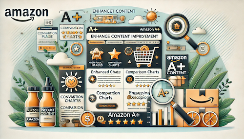
Premium Content Development

At SellerVine, we design A+ content that enhances your Amazon brand presence and drives sales. Our process includes:

  • Initial consultation to understand your brand identity and product goals.
  • Design and development of custom A+ modules with images, text, and layout optimization.
  • Content review and A/B testing to ensure maximum engagement and conversion.
  • Integration with your Amazon listings and ongoing support for updates.

Our A+ content services have helped clients increase their conversion rates and strengthen their brand recognition on Amazon.

Ready to Upgrade Your Listings?

Request a free audit to explore how our A+ content can enhance your Amazon presence.

Get Started Now